As our product is aimed at an elderly market, it is likely that many of the proposed users of the system will have a disability in one form or another. For this reason it is important to base our design around any disabilities that they may have.
Visually Disabled Users
Visually disabled users ranging from colour blind to fully blind have problems with images that do not provide a text description of what they show. Without a text description a user who can't see an image has no way of knowing what it is or what it represents.
These users also have problems understanding sites that are not logically built when "viewed" using a non-visual browser such as a screen reader. A screen reader is a Web Browser that reads Web sites out loud so as to make them accessible to visually disabled users. Often a Web site that looks nice visually will be a complete mess when it is listened to through a screen reader.
Hearing Disabilities
In a similar way to visually disabled users not having any way of understanding an image, users with hearing disabilities have no way of understanding information that is communicated with sound, unless an alternative is provided that does not use sound, such as a text description or an image.
Physical Disabilities
If you are not physically disabled, have you tried using a Web site without your mouse? Unless you were lucky with the site you chose then you probably found it very difficult. Physically disabled users are often incapable of using a mouse. Unless these users needs are taken into account when creating Web site navigation and input methods physically disabled users will sometimes find a Web site completely inaccessible.
Cognitive and Neurological Disabilities
Web sites can be complex, and finding the information we want can be difficult for the most able of us. This is not helped by sites that use an overly complex design, navigation that works differently on different pages (inconsistent) and distracting repetitive animation. All of these problems are compounded for users with Cognitive and Neurological Disabilities and this makes some sites completely inaccessible for them.
The following need to be taken into account when designing our system.
Text Equivalent: Always provide a text equivalent to any information you present with graphics, videos, applets, etc. Use the text to describe the content and/or function, not merely to describe the graphic. If you include a chart that illustrates how company sales rose 300% in only a year, use that descriptive text in your ALT tag ('Sales Up 300% in FY2000!') instead of merely labelling it 'sales chart graphic.'
Alternate Navigation: Always provide a text links somewhere on your page if you rely mainly on image maps for site navigation.
Colour: Don't use colour as a primary means to impart information. If you display sale items in red text, try to group them together under a text section header that says: "Sale-Priced Items!" Choose colours and colour combinations carefully too: as many as 1 in 12 white males have some sort of colour blindness.
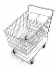
Buttons: Clearly labelled buttons as well as a description of the destination. Be particularly careful with this if you're using an image as an important link. A graphic of a shopping cart should clearly indicate that it links to the shopping cart page: 'View the contents of your shopping cart' and not merely 'Shopping Cart.'
Information taken from:
http://www.miswebdesign.com/resources/articles/accessibility-intro.html
http://www.netmechanic.com/news/vol3/design_no17.htm
Subscribe to:
Post Comments (Atom)
No comments:
Post a Comment